
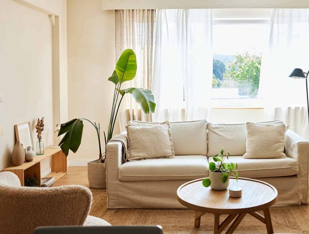
You’d think it would be simple. White is white, after all. But anyone who has stood in front of a paint chip display, squinting at forty-seven slightly different shades of “white,” knows the truth: choosing white paint is one of the most disorienting decisions in home design.
The problem isn’t the number of choices – it’s the undertones. Every white paint has them. Greens, blues, pinks, purples, yellows – they lurk beneath the surface and only reveal themselves once you’ve committed to a gallon, rolled it on the wall, and stepped back in horror. The light in your space does the rest of the work, amplifying whatever undertone is hiding in the formula. A warm, south-facing room will deepen a creamy white toward gold by noon; a shadowy, north-facing one can pull out a subtle grey or green you never saw on the chip.
Warm whites have their own challenge. The wrong one can quickly drift into beige or taupe once it’s covering an entire room. The goal is finding a white that feels warm and inviting without looking yellow, beige, or muddy.
Here are five whites worth knowing – and the right situations to reach for each one.
The Recommendations
| Paint | Brand | Character | Best For |
|---|---|---|---|
| Swiss Coffee | Benjamin Moore | Classic, versatile | Open-plan spaces and rooms with mixed light exposures |
| Crystal Haze | Dunn-Edwards | Beautiful warm white | Bedrooms and living rooms; pairs well with linen, wood, and aged brass |
| Schoolhouse White | Farrow and Ball | Warm, creamy, softly yellow | Kitchens with shaker cabinetry, period homes, cottages |
| Vapor | Benjamin Moore | Very warm and inviting | Dining rooms and reading nooks; holds up beautifully under evening light |
| Drop Cloth | Farrow and Ball | Soft, layered, understated | Rooms with natural materials – jute, linen, raw wood |
Know Your Space Before You Choose
Before committing to any white, take stock of the room itself. The paint is only one variable – and often not the most powerful one. These factors will do more to determine how a white reads in your home than the chip ever will.
Light Direction: North-facing rooms receive cool, indirect light all day and will amplify any grey or green undertone. South-facing rooms get warm, generous sun that can deepen even a pale white. East and west rooms shift dramatically throughout the day – test at multiple times before deciding.
What’s Bouncing Off the Walls: White reflects everything around it. If your furniture or soft furnishings lean toward red or rust, your white walls may pick up a faint pink cast. Autumnal golds and ambers will push it warmer. This isn’t a flaw – it’s how light works – but it’s worth accounting for when you sample.
Fixed Finishes: Your floors, countertops, cabinetry, and tile aren’t going anywhere. Look at their undertones first. Warm honey oak floors call for a soft, warm white; cool stone can balance something a little more neutral. A white that fights your fixed finishes will always feel slightly off, no matter how beautiful it looked on the chip.
Artificial Lighting: Your bulbs matter as much as sunlight. Warm LEDs deepen warm undertones at night; cool daylight LEDs can shift a soft white toward grey. Always test your samples in the evening with the lights on – this is the step most people skip, and the one that causes the most regret.
The Golden Rule: Always Test First
No matter how much you love a paint on someone else’s walls or in a magazine, you cannot skip the sampling step. Paint a large sample – at least 12″ x 12″ – directly on your wall, not on cardboard, which has its own undertone and will skew the reading. Sample in two or three rooms, because the same color genuinely looks different in every space. Test near your fixed elements – flooring, cabinetry, countertops, tile – as this is where undertone clashes reveal themselves. Check in morning light, afternoon sun, and under your evening lamps. Live with the samples for at least 48 hours, as colors shift with the weather and the season. And always sample next to your trim – even if you’re using the same color, trim is typically a different sheen, and that alone can change how the whole wall reads.
Choosing white is ultimately about understanding your space – the light, the materials, the life that fills it. A perfect white isn’t a number on a chip. It’s the one that makes your specific room feel exactly the way you intended.